This is a rather long-winded story behind the making of my 2015 computer rendered Christmas card.
I’m guessing it was 40 years ago there was a funny article in an old Mad Magazine titled “Rewriting Your Way to a PhD”. It showed a bunch of papers that a student had written starting with one in the first grade about “How I Spent My Summer Vacation”. He had visited his uncle on a pig farm and how the pigs had had funny eyes that stared at you and they stunk real bad. He then wrote a Jr-Hi book report that he somehow tied back into his experiences spending the summer on his uncle’s pig farm. It went on into a high school term paper and eventually his PhD thesis about how inner-city youth turned to crime because they never had the opportunity to visit their uncle’s pig farm on their summer vacation when they were little.
| NOTE: After writing this blog, a Google search revealed this bootleg copy of the article. It was actually issue #158 from April 1973. My recollection of the PhD thesis was different but the gist of the article is as I described. |
Throughout my life there have been experiences where I catch myself doing the same thing. It was a running joke with my mom with whom I shared that old story from Mad Magazine. Whenever she or I would repurpose something for a new use, one of us would say to the other “There we go rewriting our way to a PhD again”. She really loved that story.
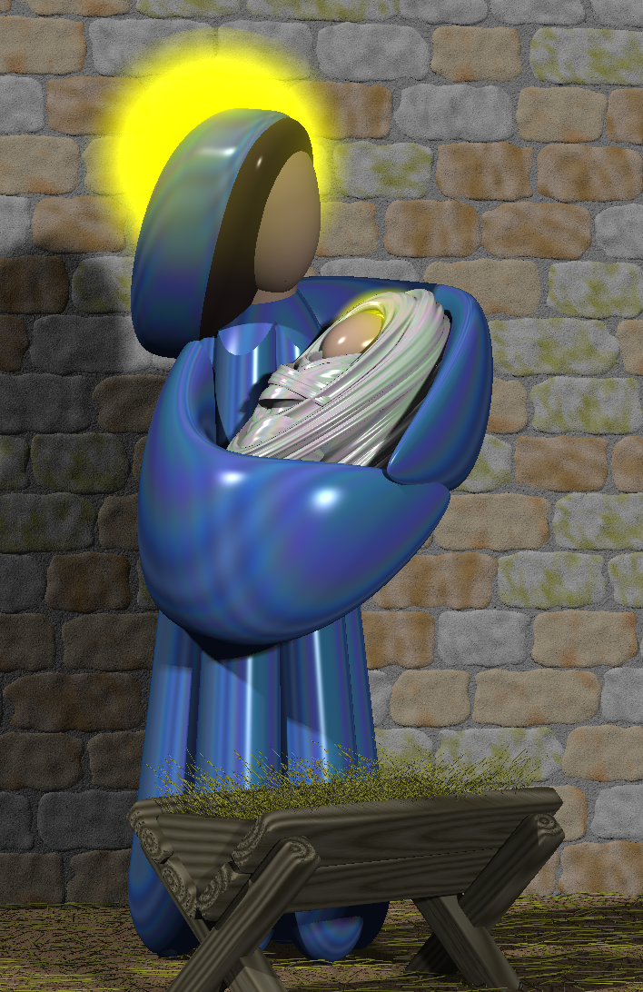
One example of the continual rewrite is found in the creation of my computer rendered Christmas cards which I have made every year since 1995. My very first card featured a couple of angels hovering over the Town of Bethlehem with the Star shining down on the town. The figure of the Angel was based on the design of the Saint Gabriel church logo. In 1996 I reused the Angel as a Christmas ornament on a close up view of a Christmas tree with several ornaments hanging from it. Then I took the same basic design of the Angel, got rid of the wings and the trumpet, reshaped the arms, added an infant Jesus and a manger and came up with my “Mary with Child” card for 1997. Of the 20 different cards I’ve made over the years, many people told me that the 97 card was their favorite. I even did a different version of it to blow up 8 x 10 and gave them as gifts to a couple of people. I also have one hanging in my bedroom.
For reference here is a table of all 20 cards. You can click on each one to see it larger.
 1995 |
 1995 |
 1995 |
 1998 |
 1999 |
 2000 |
 2001 |
 2002 |
 2003 |
 2004 |
 2005 |
 2006 |
 2007 |
 2008 |
 2009 |
 2010 |
 2011 |
 2012 |
 2013 |
 2014 |
 2015 |
The same basic style of somewhat abstract faceless figures has been reused in my cards many, many times. In 1998 we had the 3 Kings visiting. In 2001 I reused the 1997 scene but added Joseph to the mix. That same image was used as the cover of a CD of Christmas music created by some people at my church. The 2002 card featured shepherds and angels. In 2003 I got a little creative. I had Mary and Joseph arriving at the inn and being turned away by the innkeeper. I had to adjust the design for Mary to make her belly bulge because she had not yet delivered. You could see the empty stable in the background and the innkeeper was pointing towards it.
In 2005 which was the 10th anniversary card, I incorporated something from all of the previous cards into a nativity scene underneath the Christmas tree with presents, a piece of cake and a glass of milk for Santa. In 2009 I did an image that was really the prequel to the Christmas story. It depicted the Angel Gabriel announcing to Mary that she would be the mother of the Savior. It was loosely based on some wooden carvings from Saint Gabriel church. In 2010 I had just purchased a 3-D TV so I took the nativity scene pretty much the same as it had been in the 2005 card but I rendered it in 3-D and supplied a pair of cardboard red/blue 3-D glasses with each card. The 2011 card was clearly the most complicated design I ever made. It depicted a dining room table with a living room in the background featuring portions of previous cards and in the corner of the dining room in a china cabinet with the entire nativity scene.
Those are just the cards that reused the basic Angel or Mary figure design. The 2006 Christmas tree was reused several times. And it was based on an evergreen branch design from 1996. An image of a dove carrying an olive branch from 2004 was reused as a Christmas ornament in later cards. A Christmas stocking and a portion of a fireplace from 2007 was reused in a broader fireplace image with multiple stockings in 2008 and again in 2011. An image of reindeer from 2013 reappeared on top of my house in 2014. I could go on and on about the various pieces of one card that reappeared in later cards.
Despite the fact that I have been “Rewriting My Way to a PhD” every year for the past 20 years, I have always considered each new card a new design which simply incorporated elements from previous cards. Of course the challenge each year was to come up with something new and better. Sometimes I sort of copped out by doing something really simple like the fractal Christmas tree design from 2000 or the very simplistic dove from 2004. But most years I attempted to outdo myself each time.
Well fans… unfortunately the well has run completely dry. I am officially totally without a new idea. Last year’s card featured Olaf the snowman from the movie “Frozen” sitting in my front yard. Since I bought a 3-D printer for my birthday this year I thought about doing the same image of the front of my house with a giant 3-D printer turning raw snow into multiple snowmen. But most people don’t know what a 3-D printer looks like and it was just too much of an inside joke. I was afraid nobody would get it. I could’ve put a big sign on it saying “Snowman Printing 3-D Printer” but any joke you have to explain just isn’t worth it.
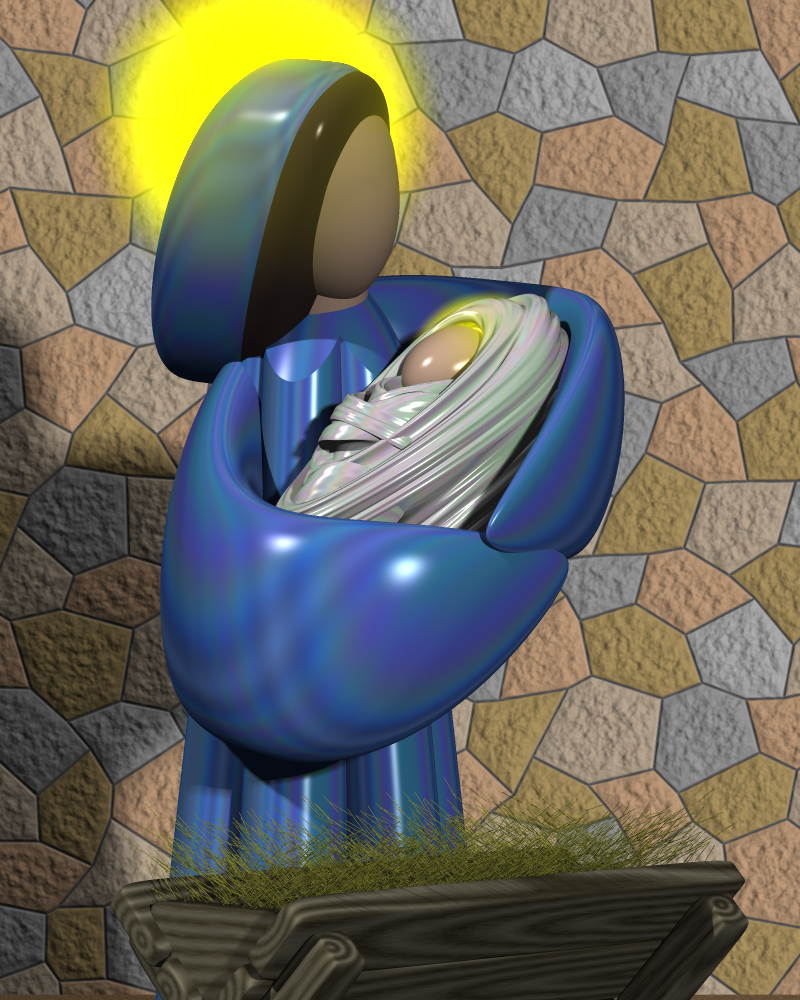
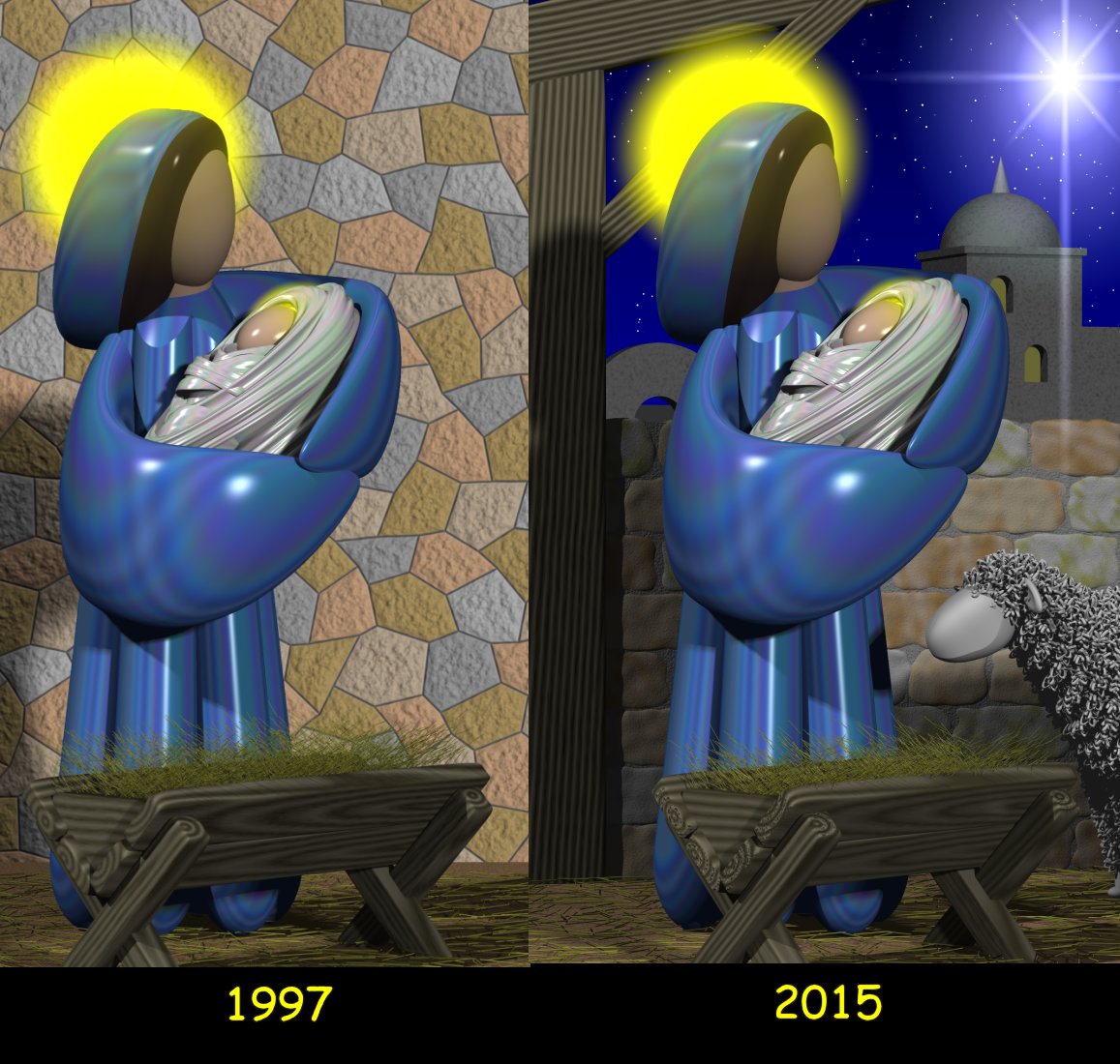
I started “leaking” the news to various friends and family that this year’s Christmas card was likely going to be a completely reissued copy of a previous card. The classic 1997 Mary with Child seem to be everybody’s favorite and I had hoped that bringing back a favorite would minimize any disappointment that there wasn’t something new and better. I told people I was considering touching it up a little bit. My sister Carol asked “Was there something that you wanted to do in 1997 that you couldn’t do because the computer wasn’t powerful enough? Technology has come a long way and you are making way more complex designs than you used to?” Indeed the software and hardware had significantly improved. There is no way I could’ve done some of the later cards using 1997 technology. But there really wasn’t that much that I could upgrade in the image from 97. Here’s a closer look at the card.
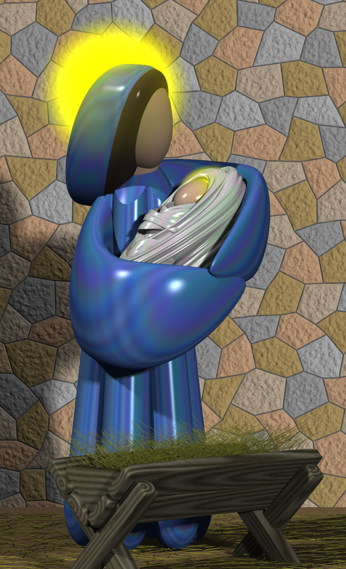
There was one part of that card that I didn’t particularly like. I was never completely satisfied with the stone wall in the background. I had used a technique where you basically create an image of the wall separately from the main image and then render it as a flat background behind your figures. Looking at it for the past 18 years I’ve often thought it looked just too fake. If I could change anything about that image I would’ve redone the wall. I didn’t want to spend too much time on this. It wasn’t just that I was out of ideas that brought me to this place. I also had so many other things going on that I didn’t have time to create something new from scratch. When I’m designing these cards have to put aside the whole day for several days where I can bury my head in the work and do nothing else. I just didn’t have the time to devote to it this year.
When Hollywood remakes a new movie that is basically a retread of an older film, they’ve stopped calling it a remake because that’s just too cheesy. Somewhere along the way they came up with the phrase “a reimagined version of the original”. So that’s what I was going to do. I was going to reimagine the 1997 card and I would start with that ugly stone wall.
Before I “reimagined” the stone wall, I realize I had already done some reimagining of the Mary figure. The computer model of the figure from 1997 was supposed to be just a one-time thing. But as I kept using the same basic design for other figures over the years I wanted to come up with a standardized body and a standardized way of manipulating the arms and the head when I attached them. I had forgotten that I had made some changes to the Mary figure after 97. When I put the original Mary into a scene such as the 3 Kings, she looked a little bit out of proportion. She was a little too short and too wide. I also modified her to be in a kneeling position for the 3 Kings image and as I did so, I completely redesigned the figure.
My rendering program POV-Ray has evolved over the years and I couldn’t even get 1997 code to render properly with the latest version of the program. So I tried to take the updated model and put it into my reimagined 1997 scene. It just didn’t look right. One of the dramatic parts of that original was the way her arms so fully envelop the infant. I never realized it but to get the right impact for that particular image, she needed to be out of proportion. There was one other difference I hadn’t noticed. I was used to looking at the 8 x 10 version of the image that has been hanging on my wall for years. But the original Christmas card was much taller and narrower.
|
|
In order to get it to look right for the wider 8 x 10 framed version, I had actually cheated. I just arbitrarily moved the Mary figure down a little bit to get it to fit in the frame properly. You couldn’t tell it because the floor was chopped off but if you look at a wider version of the 8 x 10 image here, the bottom edge of her robe is actually embedded in the floor.
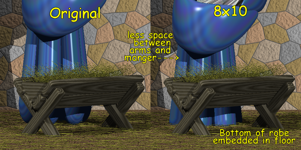
By lowering her to get it to fit the frame, it even added to the slightly disproportionate aspect of the image. But it was that disproportion version that I and my friends have been working for years and I wanted to get that back again. Rather than trying to get the updated model to look like the old one, it was easier to fix the old model so that it would render properly with the updated software. Basically I spent a day and a half trying to fix this and when I was done all I really had was my original image back again. It wasn’t until the second day that I actually got around to fixing the thing I wanted to fix… the wall.
An early version of that wall used a mathematical pattern known as a Voroni diagram. You take a random set of points in a flat plane and computes a series of irregular shaped polygons such that every point within the polygon is closer to its central point than to any of the other surrounding random points. The POV-Ray rendering program has a built-in Voroni which created shapes that were nicely random but they varied in size too much. It would end up looking like there were some very tiny bricks and some very huge bricks. Instead I spent a lot of time back in 97 coming up with my own design which simply started out with a hexagonal grid like a honeycomb. Then I randomly moved the corners a short distance to make the bricks look irregular. It’s not obvious that each of the bricks actually started out having six equal sides. It was better than the totally random Voroni version but I still didn’t like it. It was the best I could do at the time.
The 2009 card which featured the Annunciation included a new brick wall that I designed for the card. It consisted of long rectangular slabs of sandstone and was modeled after the exterior sandstone brick on Saint Gabriel church. I had tried to come up with a mathematical formula to randomly size slabs and assemble them into a wall but in the end I sort of did it manually picking the size and location of each individual block. If I had had to do that for the tall wall in this new image it would take a long time. Even if I had found a way to automatically lay the bricks, I wasn’t sure that this type of stone was appropriate for a stable behind an inn in biblical Bethlehem. It looks too modern.
It just so happens that I’ve been watching a lot of TV shows set in medieval times with lots of stone castles. Shows such as “The Last Kingdom” and “The Bastard Executioner” have some really nice castles. The patterns I saw were rectangular blocks that were to be about 6×10 inches laid in a uniform height row with a typical 50 percent overlap like a modern brick wall. They look a little bit like concrete blocks using construction today. However they were smaller and they were very rough cut without sharp edges like you would see on modern bricks or concrete blocks. While they seemed to be of roughly uniform height, there was some randomness to their length. I tried to introduce that randomness but then the 50 percent overlap would get out of phase further down the row and the bricks would no longer interlock. They would have long vertical seams of mortar. I finally came up with a formula that would adjust each brick length by a random amount and then readjust the next one back by the same random amount. Then the next one would be randomly fudged repeatedly. That way the overlap didn’t get too far out of phase.
Although I wasn’t able to re-create something that looked exactly like what was used in these TV shows, after a day or two of tinkering I did come up with a stone pattern that I liked. Here is what it looked like.
I could have quit right there but I noticed that there was a lot of empty space in the image. As I’ve mentioned a couple of times, I’m accustomed to looking at the 8 x 10 version and the objects in that version fill the frame more fully. The version from the card would be taller and we would not have Mary’s feet sticking through right for the floor. That left a lot of empty space. There just wasn’t enough going on considering the complexity of the images I’ve been making in recent years. Although I liked the new wall, there was too much of it. I should also note that even though this 2015 version was going to be tall and skinny, it was a slightly different shape than the 1997 original. Back then I was printing the cards myself on glossy card stock that was 8.5” x 11” folded in half. Also my printer would not print all the way to the end of the paper. The final image was printed 7.75” x 4.75”. However in recent years I’ve been getting the cards printed at VistaPrint.com. They claim that their cards are 5” x 7” but they actually trim them down from that size and you have to render them slightly larger than that size so that it prints beyond the edge. You have to give them something extra to trim off. The bottom line is I’m rendering these cards at 7.2833” x 4.7233”. In other words it’s 2185 x 1417 pixels which is a totally weird size.
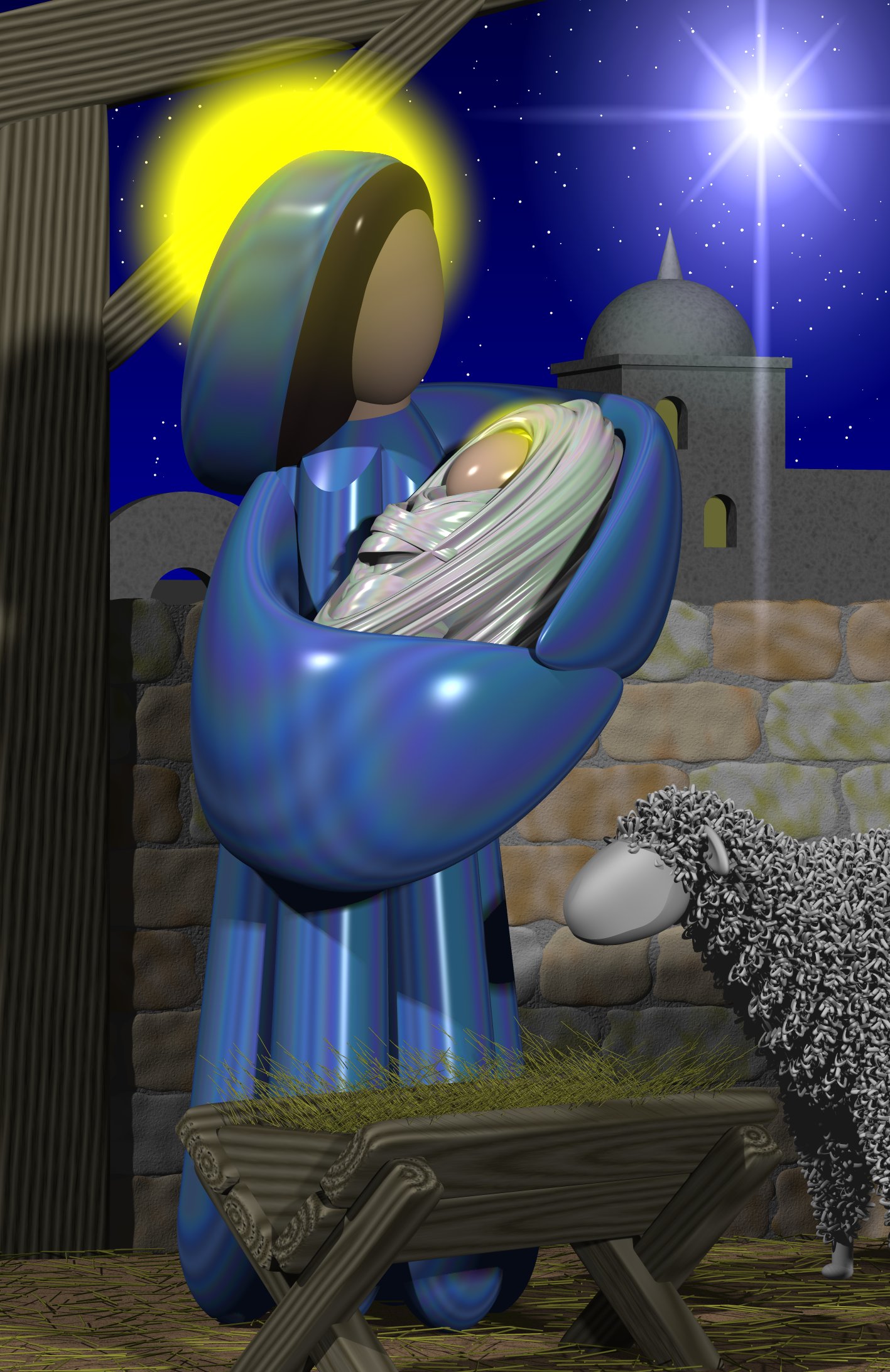
In order to deal with the fact that there was too much wall, I came up with the idea of cutting the wall down to only go up halfway. Then I could put the Star of Bethlehem shining through and some other Bethlehem buildings in the background along with a starry night sky. The Bethlehem buildings have been around since the very first card in 1995 when they were rendered extremely small in the distance. But the 3 Kings version in 98 had been blown up bigger with the star in the background. By the way the star from 98 and this image were created much differently than they were in 95. The 1995 star was actually a physical object model. It was made out of cones and long thin cylinders to simulate the rays radiating from the center. The 1998 and current star were created by a piece of software called a “lens flare simulator” that had been around since 1998. Basically you tell it where the light source is, where your camera is, and then it puts up a transparent flat plane in front of your virtual camera and draws the star pattern on it with the lens flare rays radiating from it. It’s sort of like putting a piece of glass in front of your scene and drawing the star on the glass.
If I had felt like spending more time on the image, I would’ve redesigned the Bethlehem buildings. They were originally meant to be rendered very small in the distance so they don’t have any detail to them all. With them blown up this big, I probably should have updated them a little bit perhaps putting shutters on the windows or adding other details. This is what the image looked like at this point.
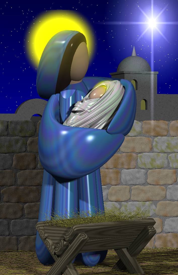
After putting all that work into the stone wall, it still felt like there was too much of it. If this was a stable, we needed animals. I’ve always wanted to do a cow or perhaps the donkey that Mary rode in on. But I wasn’t going to take on the job of creating a new animal from scratch when I was trying to get through this one as quickly as possible. I had sheep from previous cards. So I threw in a sheep.
With the wall only going halfway up, it made it look like they were outdoors standing in front of a wall rather than in a stable. So I put up some wooden beams which dated back to the 3 Kings image from 1998. Here is the final image.
Here is the 1995 image side-by-side with the 2015 version. Although I added a lot more to the image then hired to dissipated I would, I still think it’s a redo or reimagined version of the original and not a totally new image. But I like it and I hope you do too. Here are the two images side-by-side.
Because the new cards are a different shape, adding the wooden beam to the left does help fill up some space in the sheep, star, and buildings and a nice touch as well. Ironically after putting all that in, you can see very little of the new wall.
The final task was to compose something for the inside. I used to put the descriptions on the back cover and use the two inside pages for Scripture quotes. On the left panel I had put
“Therefore the Lord himself will give you this sign: the virgin shall be with child, and bear a son, and he shall be called Emmanuel – Isaiah 7:14”
On the right panel I had put
“For unto you is born this day in the city of David a Savior, which is Christ the Lord. And this will be a sign for you: you will find an infant wrapped in swaddling clothes and lying in a manger”. And suddenly there was a multitude of the heavenly host with the angel, praising God and saying: “Glory to God in the highest and on earth peace to those on whom his favor rests.” – Luke 2:11-14
That particular quote was pertinent because it describes the manger and the swaddling clothes. I could have stopped at the manger because there were no angels in this image. This quote was more fitting to my 2002 card with the shepherds of the Angels because that is where this quote comes from. However the entire quote is what Linus read at the end of “A Charlie Brown Christmas”. Because of that connection I wanted to keep the entire quote. It is different because he was reading from the King James version but this is New American Standard translation.
Since I started having cards professionally printed, I use the inside left panel to describe the card and the process that I use. That only leaves the right panel so I dropped the Isaiah quote and stuck with the Luke scripture. I thought it was especially fitting since this is the 50th anniversary of “A Charlie Brown Christmas”.
To tie into that quote I originally had added my own message “May the peace of God’s favor rest on you this new year and always!” Looking at it in 2015 I realized it didn’t say Merry Christmas which of course these days is a mortal sin. You can have a Christmas card with the Virgin Mary, the infant Jesus, the Star of Bethlehem and Bethlehem itself (not to mention the sheep and a stable) but if you don’t say Merry freaking Christmas somebody was going to complain 🙂
So this year I rewrote it to say “May the peace of God’s favor rest on you this Christmas and throughout the new year!” It still doesn’t say “Merry” but these days I would wish more peace upon people and I think the merriment would take care of itself. I dropped the word “always” because I signed the cards for friends and family “Love always, Chris”. More distant acquaintances get a just plain “Chris”. Who knows I may not love them always. We will take it year by year on the rest of them 🙂
On the inside left panel I wrote a much briefer version of how and why the card was reimagined for this year. Among the things I noted was that the card has nearly 5 times as many objects in it and was rendered at a higher resolution (more pixels) but took way lesst time to complete. In the box below is the text that appears inside the card. But for now I’m wrapping up this blog entry and wishing you all a very Merry Christmas, peaceful and blessed New Year, may the force be with you, happy holidays, happy Hanukkah (or however it’s spelled) or just plain party on dude!
About This Card In 1995 I began designing, computer modeling, and rendering Christmas cards to send to friends and family. Each year I came up with a new design. I usually reused some of the models from previous years but the design itself was always something new. Unfortunately after 20 years the well has run dry. This year I was completely out of ideas for a new card. I originally planned just to re-send my old 1997 card which is a favorite. Then several people suggested that I take an old card update it. So I did. The image of Mary, The Child, and the manger appear exactly as they did in 1997. I never liked plain stone wall behind them but it was the best I could do with 1997 technology. So I redesigned the wall this year. It is the only new element in this design. It still looked bland going all the way to the top so I only put it halfway. I then added the Star and wooden beams from my 1998 card, the background buildings from 1995, and sheep from 2002. The Scripture is the same one I used in 97. Linus quoted it in “A Charlie Brown Christmas” 50 years ago this year. The Mary figure is made of fourth order quadric mathematical surfaces. The swaddling clothes are hyper complex julia fractal surfaces. The original design took me 5 days to design and I put 2 more days into this year’s update. The original image was rendered using POV-Ray 3.02 at 1150×700 pixels on a 200MHz Pentium Windows 95 PC. The original model had 6000 objects and took 16 hours to render. The new version contains over 29,000 objects and took just 71 minutes at 2185×1417 pixels on an Intel core i7 under Windows 10. Time sure have changed 🙂 Rendering was done using POV-Ray 3.61 software which I helped write. Visit my blog to learn more about my cards. email: cy_borg5@cyborg5.com |